Fast food, fast action
My work with McDonalds PR activations has been broad and exciting, from releases of new winter and summer menus, to celebrity collaborations. This involved designing social posts, van vinyl, bags, clothing and videos/ photographs, and I even jumped in front of the camera as an featured extra when required.
In addition to the consumer facing content McDonalds also required creative assets for internal use such as staff information & training documents as well as custom logos. I also rendered ESG creatives for McD’s various charities, designs for Fun Football events, Children In Need collaborations, and social creatives for restaurant closures and operations changes during lockdown.
Bringing the magic of Disney to life
Disney+ have a huge and ever-growing collection of TV shows and movies across their Disney+ platform. With summer rolling in Disney wanted to capitalise on the changing season and remind the public of their great content in order to drive new people to join Disney+ as well as tell people already on the platform about what’s to come. Using the Tag line “A lifetime of great stories”, this campaign focused on drawing attention to Disney’s huge collection of family favourites and their new additions.
This involved deliverables across many platforms and locations. From billboards across the UK, bus T side banners, pop up activations, Disney+ platform graphics and Tube station activations. The designs focused on the lead characters from the shows, bring them to full attention across every deliverable.
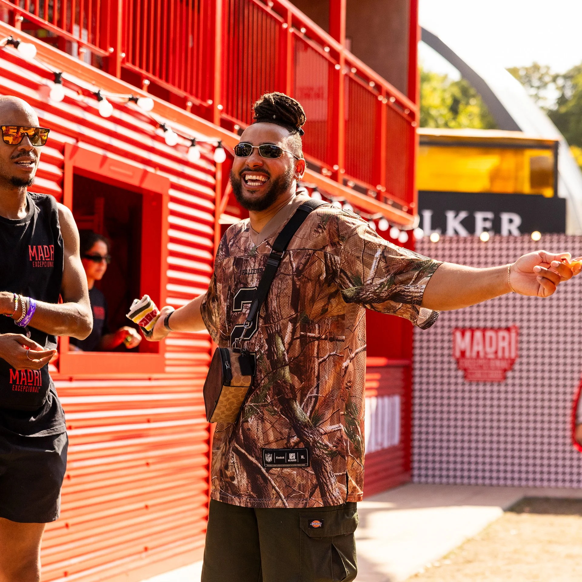
Engaging a new audience with a flagship festival experience
Bringing the energy of Madrid straight to All Points East over two sun-drenched weekends of unforgettable music, street art and ice-cold Madrí. This wasn’t your basic brand activation - it was a full-on cultural takeover, requiring bespoke designs from the bottom up.
Festival-goers wandered through a mini Madrid street, cracking secret codes to score exclusive merch. A live artist was on hand to customise prizes and level up festival ‘fits, making every win feel personal and one-of-a-kind.
From giant bottle-cap seats to immersive content spaces, Buidling the perfect backdrops for selfies, group shots, and TikTok gold. People didn’t just swing by - they hung out, vibed, and stayed for the experience.
With 96% of festival attendees remembering the experience 4 weeks later, a 9% increase in positive sentiment “Madrí’s branding is modern/contemporary” and 75% of lapsed Madrí drinkers returning to brand purchasing av. 3 times in a month after. This work is nominated for best activation at a music event for the Campaign Experience Awards.
PS5 and beyond
PlayStation joined as a client on the run up to their big release of the PS5 and as such required many social posts to help explain the features and power of their console, as well as unique posts for their hit exclusive games. To start them off we created a head-turning “take-over” of Oxford Circus, changing out all four Roundel signs with new signs integrating four PS5 symbols, each with their unique colours. Alongside the new signs for the station takeovers I created assets incorporating up-and-coming games, altering tube station names accordingly.
After the release of the PS5 I was commissioned to design more engaging creative work including a limited edition controller box which went out to press, a book of poems for The Last of Us Part 2 to engaging with the fans’ love for the first game, as well as a limited edition Sake bottle for the release of their Ghost Of Tsushima game. In addition I created a range of social posts to drive the hype around various new and classic games.
Designing content for KP Snack brands
KP Snacks have a wide range of brands all requiring fun and quirky social posts, each reflecting their distinct visual language and audience. I designed animated and statics posts for the main social platforms, requiring photoshoots for the creation of the unique visuals.
In addition KP Nuts, being the ideal brand for the job, partnered up with Movember. This collaboration required posters, limited addition personalised underwear and videos with various celebrities, all helping to promote the importance of “checking your nuts”!
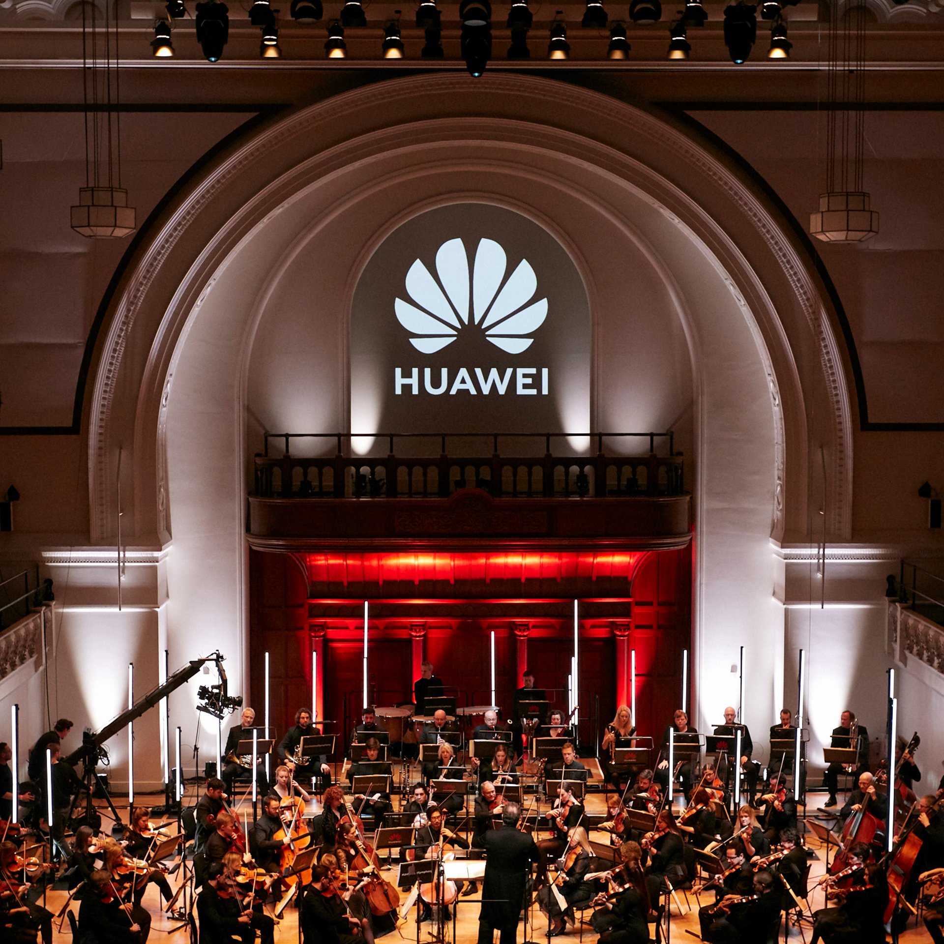
Showing off the AI power of Huawei’s phones
To gain consumer attention for their new phone line-ups, Huawei organised various events to show off many impressive functions they had packed into them, none more so than their AI.
In 2019 they had taught their AI to finish Schubert’s famously unfinished Symphony No. 8. Feeding it various tracks to see what it could produce and then getting a live orchestra to play the assembled symphony to a live audience. I created designs for various collateral for the event itself, as well as content for social media to build up hype.
I also designed a collection reviewer guides for many of the Huawei and HONOR phone releases, to show the new features of each one.
Helping Avon tackle gender, animal welfare and climate issues
Avon has long maintained a mission to drive positive change and speak out on many social issues surrounding the cosmetics industry, as well as gender inequality and gender-based violence. With this aim in mind I was excited to create reports, videos and social posts to spread the word.
Avon have always been focused on important subjects around woman’s rights and health and actively produce research and studies in these subjects. I designed several reports to highlight their findings with data and strong visuals.
Tasked to deliver a global educational awareness campaign around the importance of soil biodiversity for the beauty brand Weleda. Weleda’s Save Earth’s Skin campaign highlights the importance of healthy soil for the future of our planet and urges people to care for it as they would their own skin by creating the analogy of soil as the ‘skin of the earth’ to maximise interest while making it simple to understand. This involved designing a full comms toolkit and an identity using soil, earth and growth as a basis of the identity’s design and visual language. The campaign went live in 40+ markets across Weleda’s digital platforms, educational in-store displays, videos and pop-ups. It created a 12% uplift in sales of their Skin Food Range, plus 27,000 trees planted as a result of the sales in the UK alone.
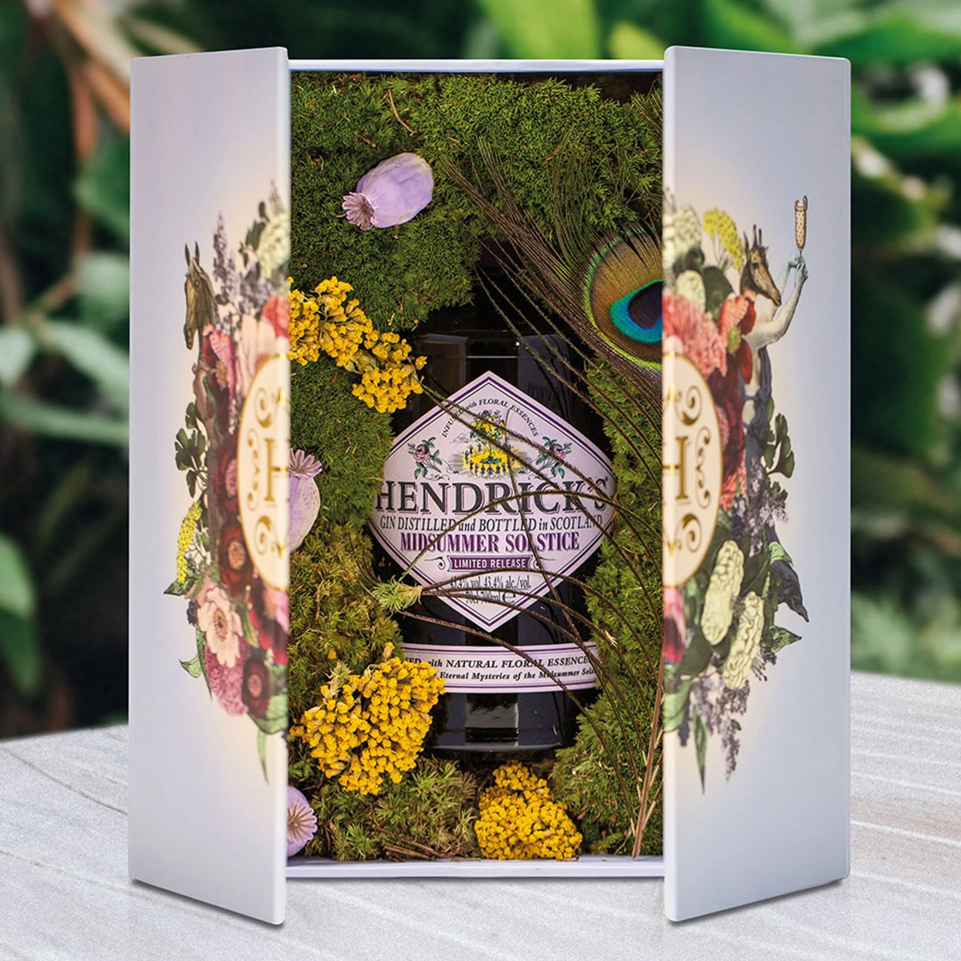
Portal into The Particular
Hendrick's Gin the delightfully peculiar Scottish gin, released several limited-edition infusions in addition to their original rose and cucumber gin. To bring attention and celebrate the release of the infusions Hendrick’s needed many quirky and curious activations that match their particular style and the taste for the unusual. Designing invites and unboxing experiences, with recorded messages and flora enmeshment, to pop-up shops that scream peculiar and artistic projections on UK’s iconic lighthouses. Bringing people into the delightfully world of Hendrick’s
Mercedes Benz (MB) are one of the largest and most recognised car manufacturers in the world, building passenger cars all the way to the Formula One, and are both consumer and business facing. The ongoing challenge is focused on MB UK which has become cumbersome, outdated and in need of modernisation.
The solution: to design a modular based system of simple and elegant elements that can be pieced together, allowing the content to flow more naturally. These needed to be fully adaptive and bring stronger focus to the images. In order to slowly migrate the existing site to the new structure detailed analysis of current content and user journeys was required, for which I produced site maps and wireframes of proposed structures.
In addition to the ongoing redesign, other projects have focused on interactive design such as the in-store touch screen visualiser and associated apps. Which allow customers to customise their perfect car while at a show room.
Coca Cola Hellenic Bottling Company Intranet
Coca Cola Hellenic Bottling Company, the world’s largest bottlers for the products of The Coca-Cola Company, required a new detailed intranet to replace their old inadequate system, while wishing to maintain the freedom of a fully built website and keeping integrated Sharepoint elements in one. The challenge was to design an elegant site for large quantities of user generated content that needed to be fully responsive for all device sizes while still integrating all the Sharepoint elements.
The outcome was a modular system that allowed for the site to grow as needed while breaking down to individual assets when the site was viewed on mobile. Content pages needed to be kept within the system, with minimum clutter and integrated iframes from Sharepoint which could be added as needed.
Bedlam is an environmentally friendly brewery on a farm in the heart of the South Downs brewing great beers with Solar Power. The brand offers 4-5 different cask beers available in either on draft or by the bottle in and round the UK. Bedlam required a complete redesign as they felt their branding, being mostly dark colours, had gone mostly unnoticed despite the company’s eagerness to grow and compete with the growing ale market.
The idea was to stay away from the obvious, avoiding connotations to chaos and madness inherent in the brewery’s name and instead position the brand into the modern; minimal but high impact, with a focus on the eco-friendly nature of their business. The work focused on the B and the main ingredient, the hop. I kept it stylish, simple yet striking, using strong colours and simple line drawings to stand out over other beers across the bar. A range of colours indicate the different products, and extra elements such as printing straight onto the bottle and die cutting the tap signs help add a craft feeling to the beer.
S. Pellegrino Young Chef Academy 2023 and 2024
The S.Pellegrino Young Chef Academy exists to empower young chefs, helping them to succeed through education, mentoring, networking and career opportunities.
San Pellegrino hosts a competition to find the most talented young chefs in the United Kingdom each year. To make the event a success San Pellegrino required various collateral, from name cards, wall dressing and table dressing, to menus and trophies.
Bringing Stocks Spirits vision into their first annual report
Stock Spirits is a Central and Eastern European branded spirits producer, with a variety of best-selling brands across Italy and Poland.
In 2012 they listed on the UK stock exchange and required their first annual report. The report was designed as template for all future reports as well as internal communications where they were previously lacking.
A catalogue of photos that focused on staff, factories and lifestyle shots was also briefed and commissioned for use in the report and on the website.
To promote the Rugby World Cups Sevens in San Francisco through consumer and trade activity
Working with Greene King IPA (IPA) to promote the 2018 Rugby World Cups Sevens (7s) held in San Francisco. This message is underpinned by the chance to win flights and tickets to the tournament.
The promotion is achieved via competition adverts on the IPA’s 500ml beer cans, 4 can packs, 10 can packs, 15 can packs and one pint bottle necks. With further trade activation in all Greene King owned pubs via beer mats, posters, beer pump and bunting.
Will be available in supermarkets across the UK early 2018.
Highlighting the preformance of 2014 and celebrating 150 years of HEINEKEN
HEINEKEN wanted a colourful report in order to engage with stakeholders wherever they are. Drawing from data on sustainability, sales, markets and trends, we created a set of striking infographics focusing on HEINEKEN’s operations and key brands in order to add life to interesting facts and figures. These graphics where then fed across all platforms, from the AR to the website and on their social media streams.
The report was designed to be interactive in addition to being printed. The infographics where also adapted to accommodate on the HEINEKEN website.
Promoting the 2021 World Championships in Athletics in Oregon
Oregon has planned OOH media this summer at the same time as World Championships in Athletics (WCA) is held in London to promote the 2021 WCA which is going to be held in Oregon. The media has been planned to concentrate on activity around the Olympic Stadium during the first two weeks in August, while also targeting large footfall rail hubs that would be used en-route to the championships at the stadium in London.
Through mainly static advertising and one motion site, the adverts are to raise awareness of Oregon and the 7 wonders that make up Oregon and gain further UK travellers to the state. juxtaposing athletics games over images of some the 7 wonders.
smart are a young and creative company always challenging the norm with their ultra compact cars and require infographics to match. The task was to design multiple infographics to better explain the key points of what make a smart car so great, using smarts colour and playful design style.
smart also required various designs and updates to their Uk site from large scale page restructures and redesigns to entirely new microsite for new product ranges or simply finding an approved used car.
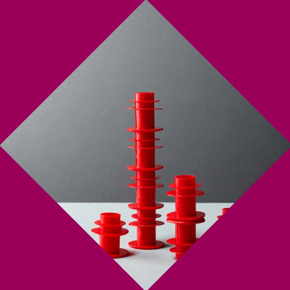
Designing the essential for the essential enablers
Essentra are a leading international supplier of specialist plastic, fibre and foam products. After many years as Fitrona they felt it time to re-branded to highlight their philosophy ‘that little things make the world go round’ and to integrate the many arms of their divisions.
As part of the re-brand they required a new corporate website, of which used the strong typographic focus, geometric shapes and colours from the re-brand.
With Essentra being a huge international company, they also required a divisional companies brand guideline (now branded under one roof) so that they could redesign their own sites and documentation to match, while reflecting the division assets such as logos and textures in addition to supporting e-commerce abilities in the designs.
In addition, I was also in charge of photographing packshots of various products Essentra produce for use in a catalogue